
Why a galaxy, not a graph
The first version was a flat 2D graph. It held up fine until I kept adding games, and then flat space just ran out.
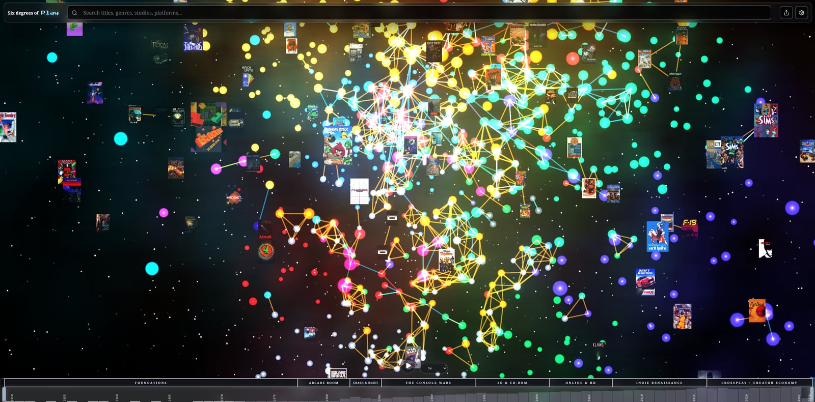
The first version of Six Degrees was flat. Dots and lines on a plane, the way you would diagram anything. That was fine while the map stayed small.
What broke it was just adding more games. A few dozen is a tidy little web. A few thousand is a hairball. Flat space ran out fast, there was nowhere left to put anything, and every new line made it worse.
So I went looking for more room, and more room meant a third dimension. A galaxy you fly through instead of a chart you stare at.
The other half of it was something I had wanted since this was still just an idea I couldn’t build. I wanted to grab a game, drag it, and have its connections come drifting loosely along behind. So the strength of a link became an actual physical pull. The heavy connections, the direct ones, same studio or same director, drag two games in tight until they are basically neighbors. The loose ones, shared genre or a similar art style, just let two games drift somewhere near each other. You can tell how related two games are by how hard they are hanging onto each other, which saves anybody reading a legend.
None of that was planned. I kept asking the map to show me more, and more turned into a third dimension and a bit of physics. It is just where the problem kept leading.
all Six Degrees of Play updates